How do I optimize the images I’ve already uploaded to my website?
Once you’ve selected your images and then prepared them for upload, here’s what comes next.
Compress and Resize Your Images with Imagify
There are many causes of a slow website, but unnecessarily large image files are one of the most common. A great compression plugin shrinks these unoptimized image file sizes, ideally with little to no visual degradation. This allows them to download to your visitor’s browser more quickly.
We’ve tested half a dozen popular, WordPress image compression plugins; most were frankly mediocre, either offering negligible compression ratios or unacceptable loss of acuity.
More recently, WP Media (the team behind WP Rocket) introduced Imagify, a best-of-both-worlds WordPress plugin which offers impressive compression ratios and on-the-fly image resizing with little to no perceptible loss in image quality.
With few exceptions, we now install Imagify for all of our clients, connect our API key, set Imagify to use Aggressive compression and resize large images with a maximum long-edge of 2,400px.

That’s all there is to it! You have gorgeous, lightweight, web-ready images which look great on iPhones and 27″ iMacs alike.
Why Resize to 2,400 pixels?
For many years, computer displays shipped with a relatively predictable configuration of pixels. There were a few variations but for the most part, you were able to size a given image to exact specifications with a first-hand understanding of how it would look on any device.
Now, there are countless displays on the market and more being introduced all the time. Handhelds, tablets, laptops, desktops, “standard” density, “high” density (e.g. Apple’s Retina line-up) and much more.
2,400 pixels isn’t a magic number; for us, it simply represents a “feels right” compromise between speed (files which aren’t too large and therefore slow to load) and detail, an image which will look good on a large display and a handheld. You could just as easily choose 2,500 pixels or even 2,000 pixels.
Displaying Your Images
Once you’ve added your images to the WordPress Media Library, it’s time to put them up on your website!
Because the display of images is heavily dependent on your selection of theme and in some cases, plugins, we cannot write a comprehensive tutorial for publishing an image to a given area of your website.
Rather, we’ll focus on a couple of core concepts which [should] apply no matter which theme you’ve selected.
Use of Mobile Responsive Theme and the srcset and sizes attributes
WordPress 4.4 introduced native support for responsive image sizes, adding srcset and sizes attributes to your image tags. These attributes instruct a browser to load the image file which is most appropriate for the device and screen dimensions.
With few exceptions, images throughout your Posts will be filtered automatically to take advantage of these optimizations; however, many themes don’t yet apply them to Pages or other content types. If in doubt, feel free to ask us or take a look at our recommend theme and page builder.
Featured Images
Virtually all posts, pages, products (in WooCommerce) and many other custom post types make use of a Featured Image.
This will almost always be to the lower-right of the edit view:
If we’ve used Beaver Builder to develop your site, then the Featured Image often doubles as both a thumbnail in post listings:
And then again as a hero image for the post itself:
Again, depending on your theme, your mileage may vary.
Alt Text
We’ve written a separate article which discusses the use of alt text for SEO.
Miscellaneous Q&A
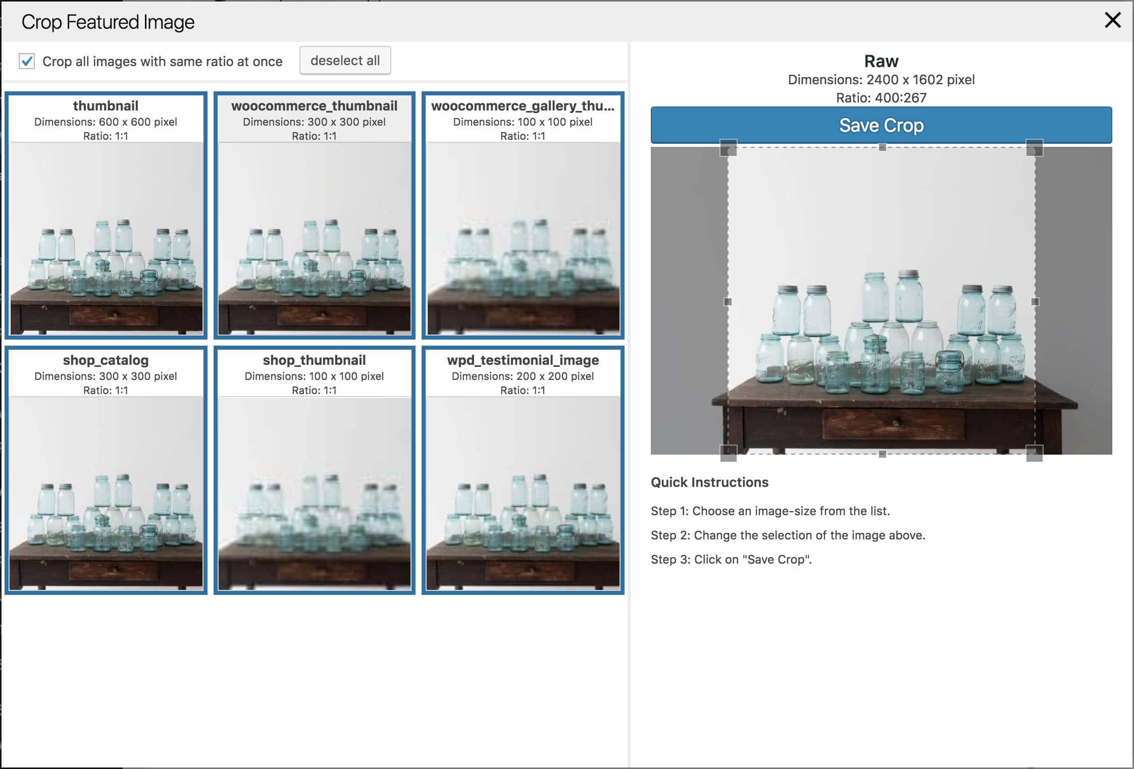
“How do I adjust the image crop?”
Suppose you’re using WooCommerce, which crops any/all uploaded images into a square for use throughout the WooCommerce product pages.
What if you don’t like the default crop it chose?
Fortunately, there is a plugin available on the WordPress repo, which we’ve used with great success to re-crop images. It looks something like this:
“GTMetrix is complaining about my images; help!”
GTMetrix is a utility which evaluates a wide variety of criteria relating to the speed of your website.
All else being equal, faster websites convert better; the human attention span is notoriously short. Faster websites might even rank better in Google.
We certainly use and recommend the use of GTMetrix, Google Page Speed Insights and similar tools to evaluate a website; they’re great for identifying and correcting low-hanging fruit, many of which boil down to use of a fast host, sensible theme and a great caching plugin.
However in our experience, their definition of an “optimum” image file size represents an often unacceptable loss of image quality.
In other words, if you’re using Imagify as we describe above, then we probably wouldn’t recommend you take any additional steps.
“So my website is nine years old and I’ve never done any of these things; am I screwed?”
Probably not.*
First thing’s first; activate Imagify and ensure that it has Bulk Optimized your entire Media Library, using the configuration we recommend above.
From here, whether or not you want to go back through your entire Media Library and update your alt text is up to you.
Is SEO an important acquisition strategy for your business? (For that matter, have you performed the requisite keyword research?) If so, maybe it’s worth paying an intern to devote a day to it.
If not, then we’d recommend you simply be conscientious of this advice going forward.
TL;DR
- Use Imagify to resize and compress your images.
- Ensure that your theme renders images with mobile-friendly attributes like srcset and sizes.
- Use appropriate alt text.