Create overlapping content in Beaver Builder
Once you’ve mastered the basics of creating layouts in Beaver Builder, you might want to take a more advanced approach, in the interest of making your layouts less grid-like.
With a few adjustments to margins and padding (all in the Advanced tabs of their respective elements), you can easily create columns or modules that overlap adjacent content; here’s how it works.
Begin with your basic layout, placing your rows, columns and modules in their default positions, relative to one another.
For purposes of this article, here is our starting point: a row with a gray background color and two columns, the first a Heading and Text module, and the second n Photo with a square crop applied.
FIRST EXAMPLE: OVERLAPPING ROWS
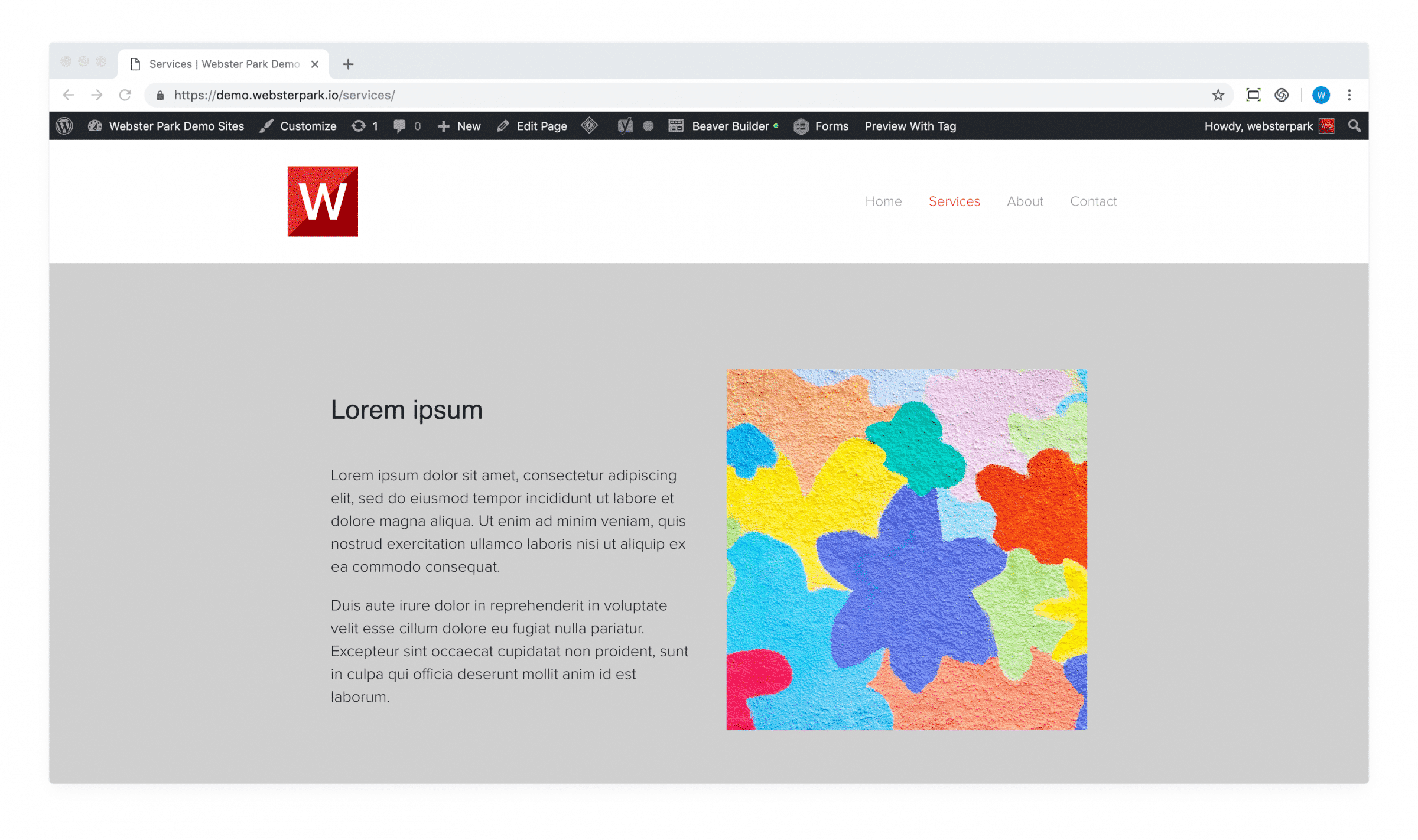
Just below it, there is another row with a red background color, containing a column with Heading and Text module; the column itself has a white background color applied.

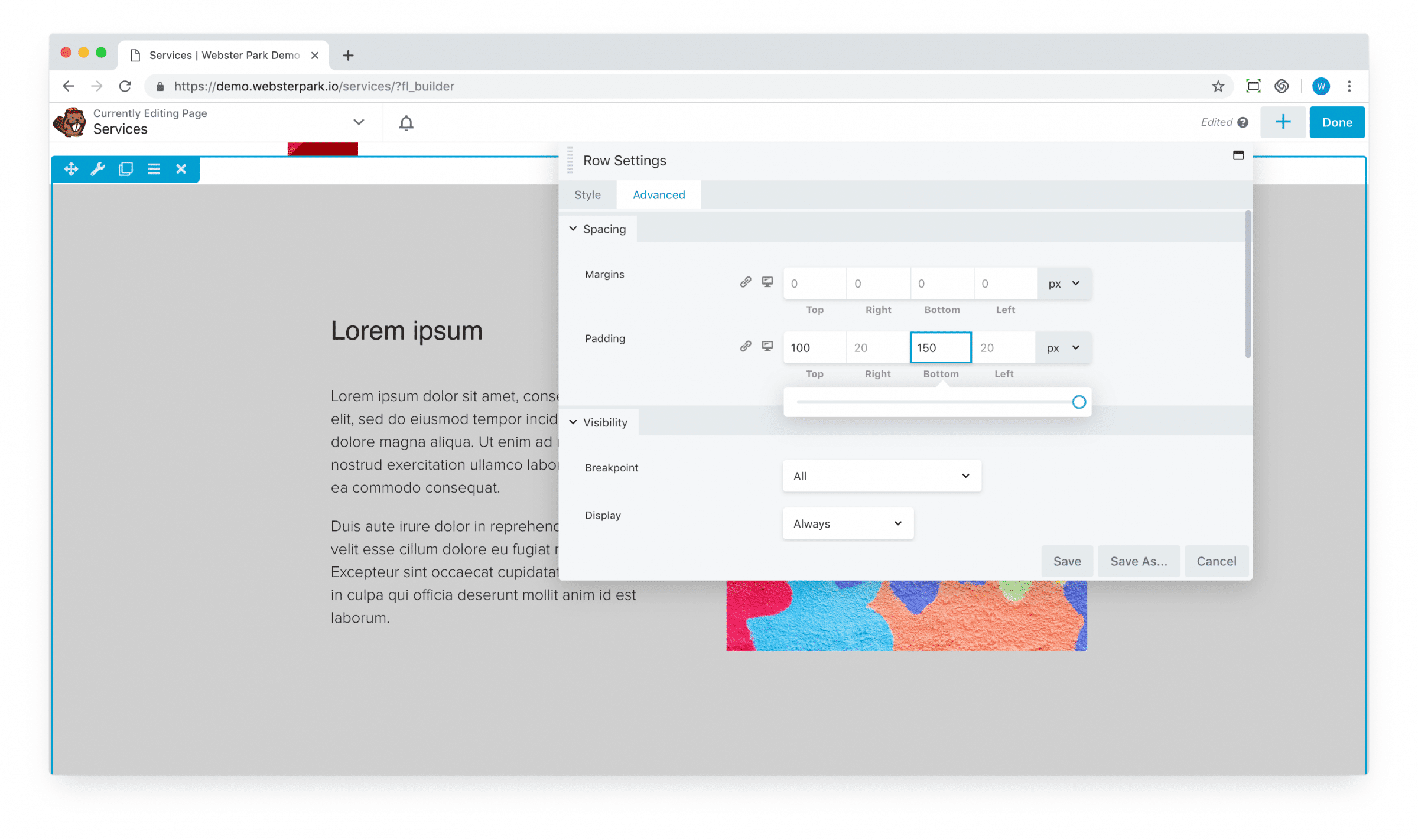
1. Begin with adding some additional padding the row which will be overlapped.
This will maintain the appropriate spacing between the “foreground” elements (text, images, etc.):
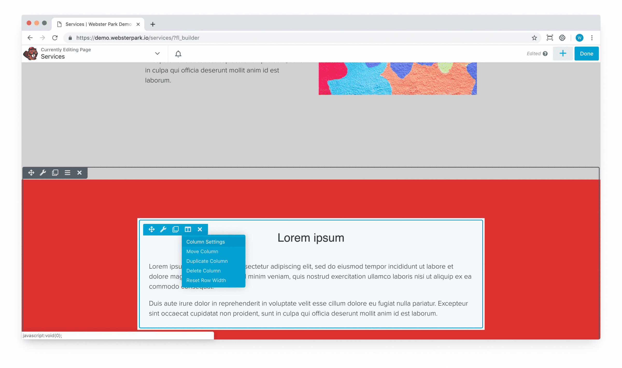
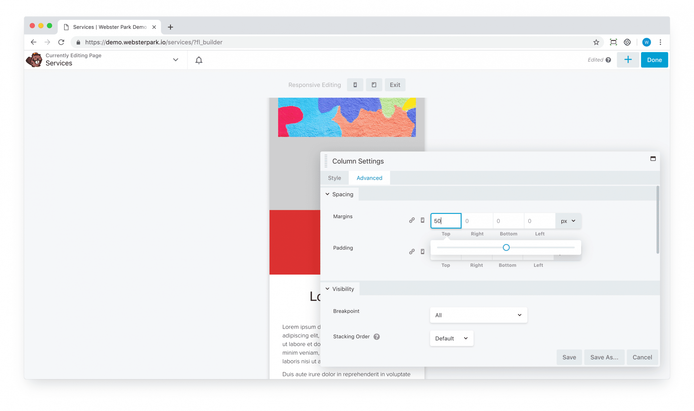
2. Next, for the content which will overlap its neighboring content, click to update Column Settings:
3. Click over to the Advanced tab for the column, and apply negative margin to bring that column (and its contents) upward.
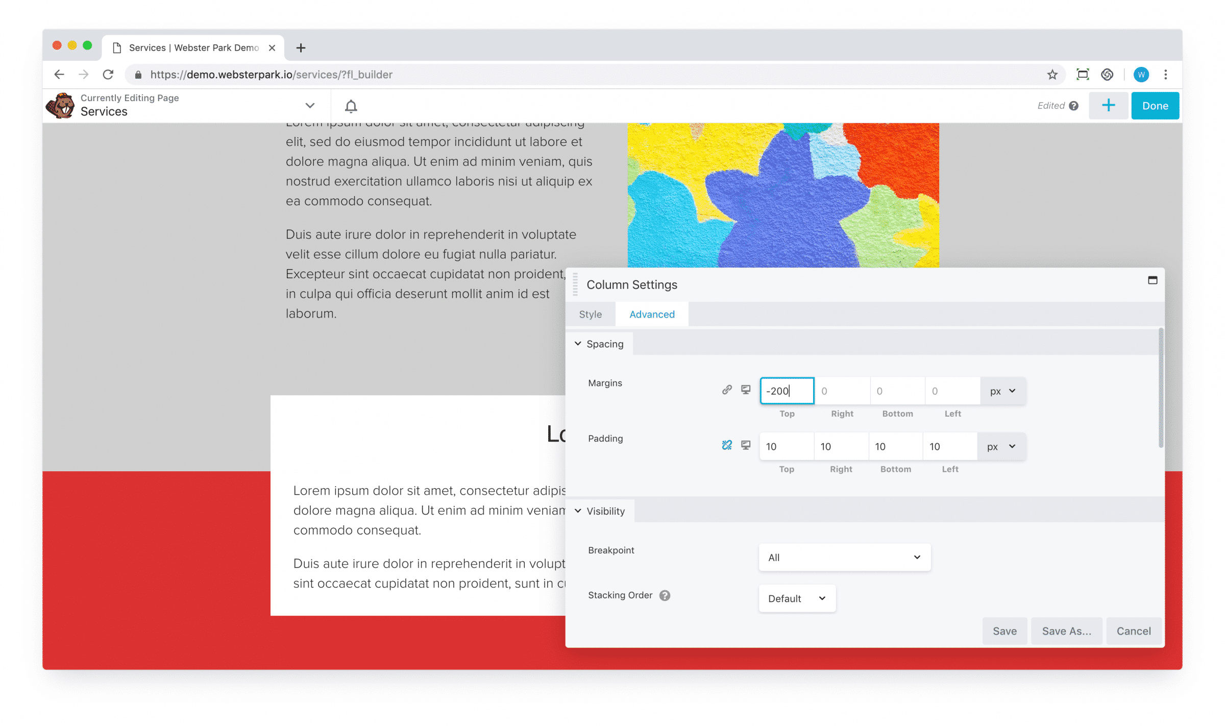
4. Take a moment to click into the responsive settings for that column; overlap may create visual spacing issues on a tablet or mobile device, and so you may want to revert the negative margin back to its default setting of 0 for these devices.
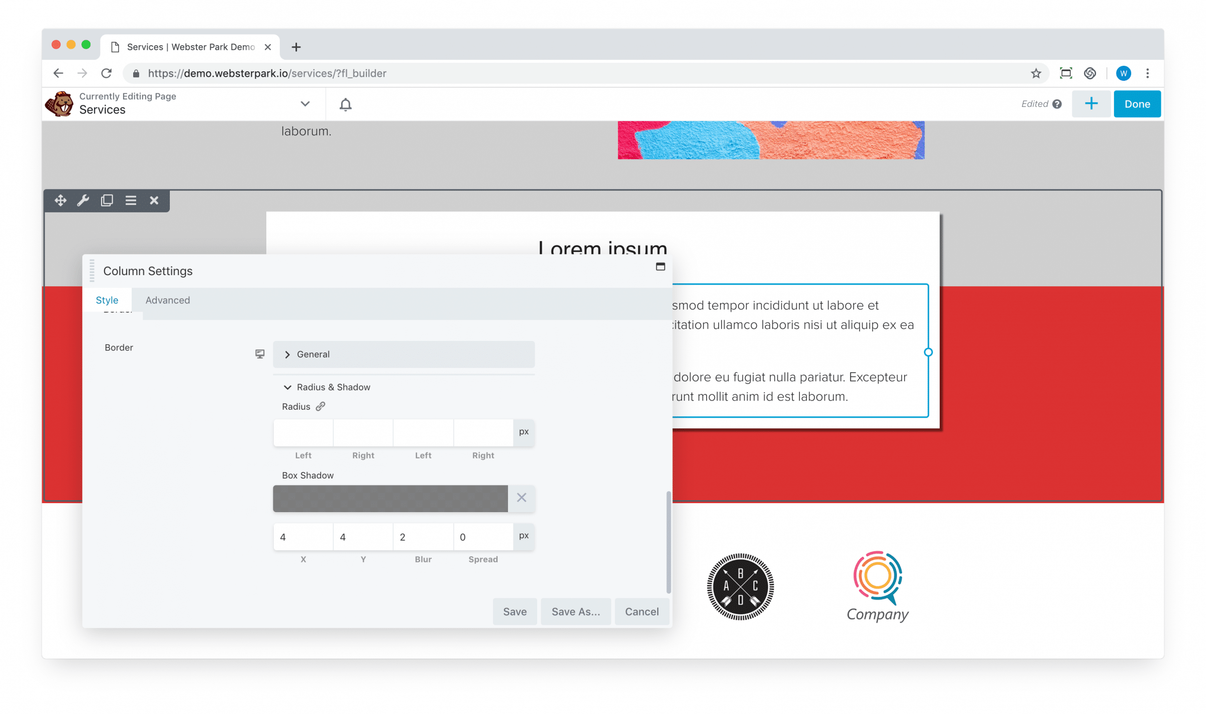
5. Optionally, you may want to apply a slight Box Shadow effect to the column, to make it stand out more.
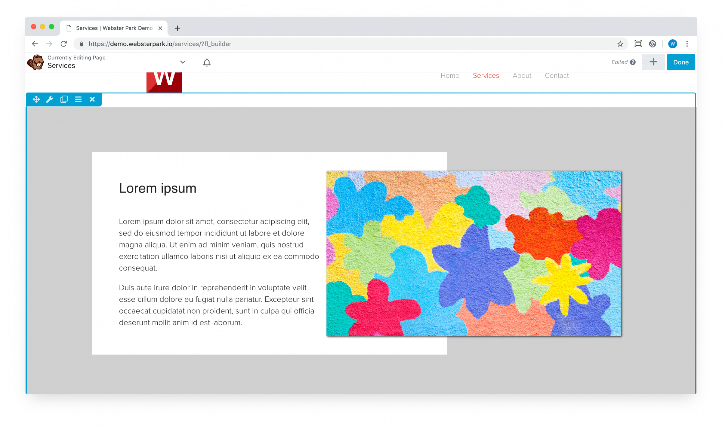
SECOND EXAMPLE: OVERLAPPING COLUMNS
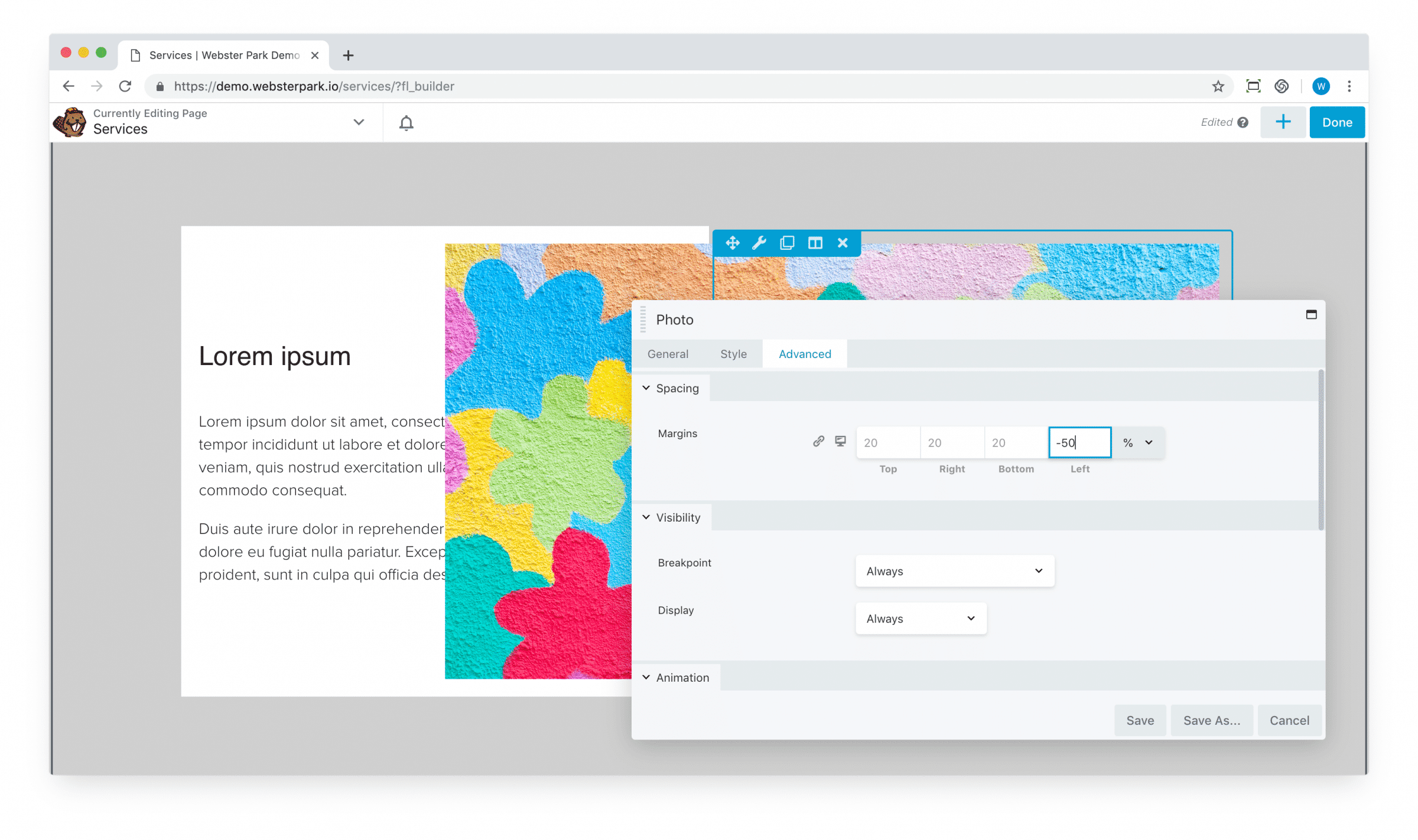
1. Returning to our previous example, you can apply a similar negative margin to the Image module to bump it over to the left.
Note also that you can specify a percentage adjustment (usually, calculated as the percentage of the containing parent element, whether a column or row) as opposed to a pixel adjustment:
2. However, that’s obviously overlapping our text; to compensate, we can apply an equal but opposite padding to the containing column (adding a much smaller amount of padding to the other three columns to give us a little bit of additional spacing):
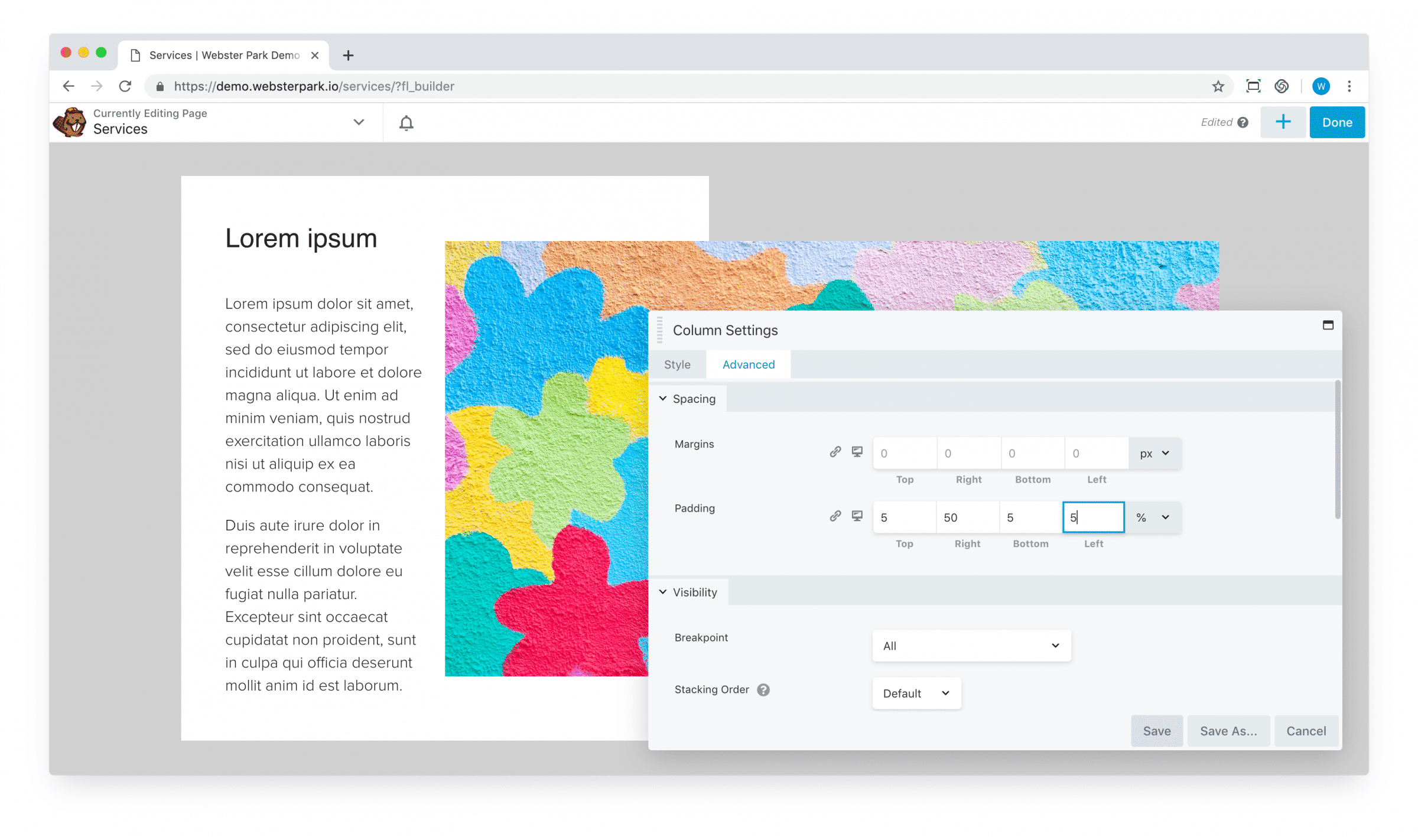
3. We’ve used 50% thus far, but we can easily experiment with different ratios to achieve a different layout.
One final tip: note that negative margins cannot always be applied to “pull” content in one direction; conversely, positive margins can always be applied to “push” it.
That’s it!