Beaver Builder basics
In fact, no single tool has revolutionized our lives and the lives of our clients like Beaver Builder has. While intuitive in many respects, this article is written to help you familiarize yourself with the basics and get up to speed as quickly as possible.
Rows, Columns and Modules
All layouts within the Beaver Builder are essentially comprised of Rows, Columns and Modules:
- A page is comprised of one or more Rows;
- Each Row is then comprised of one or more Columns;
- Each Column is then comprised of one or more Modules.
Accessing the Page Builder
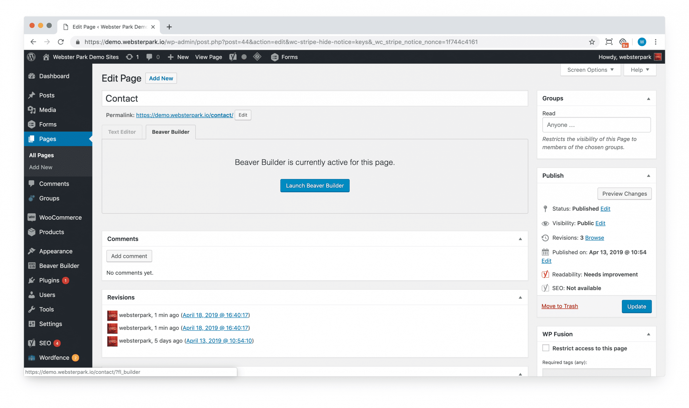
Once logged into WordPress, you can either click Pages, select the Page you want to edit, and click Launch Beaver Builder:
Or you can navigate out to the page you’d like to edit from the front-end, and click Beaver Builder in the top menu:

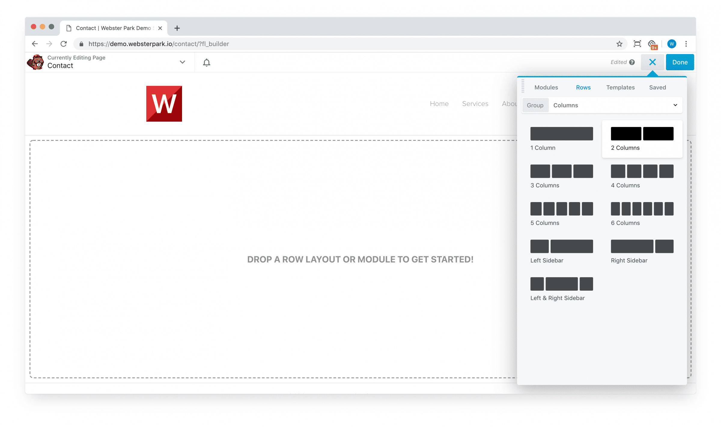
Creating Rows
Once you’ve opened up the Builder, click the (+) to the top-right to begin.
You can either drag and drop a blank Row (with one or more blank Columns):
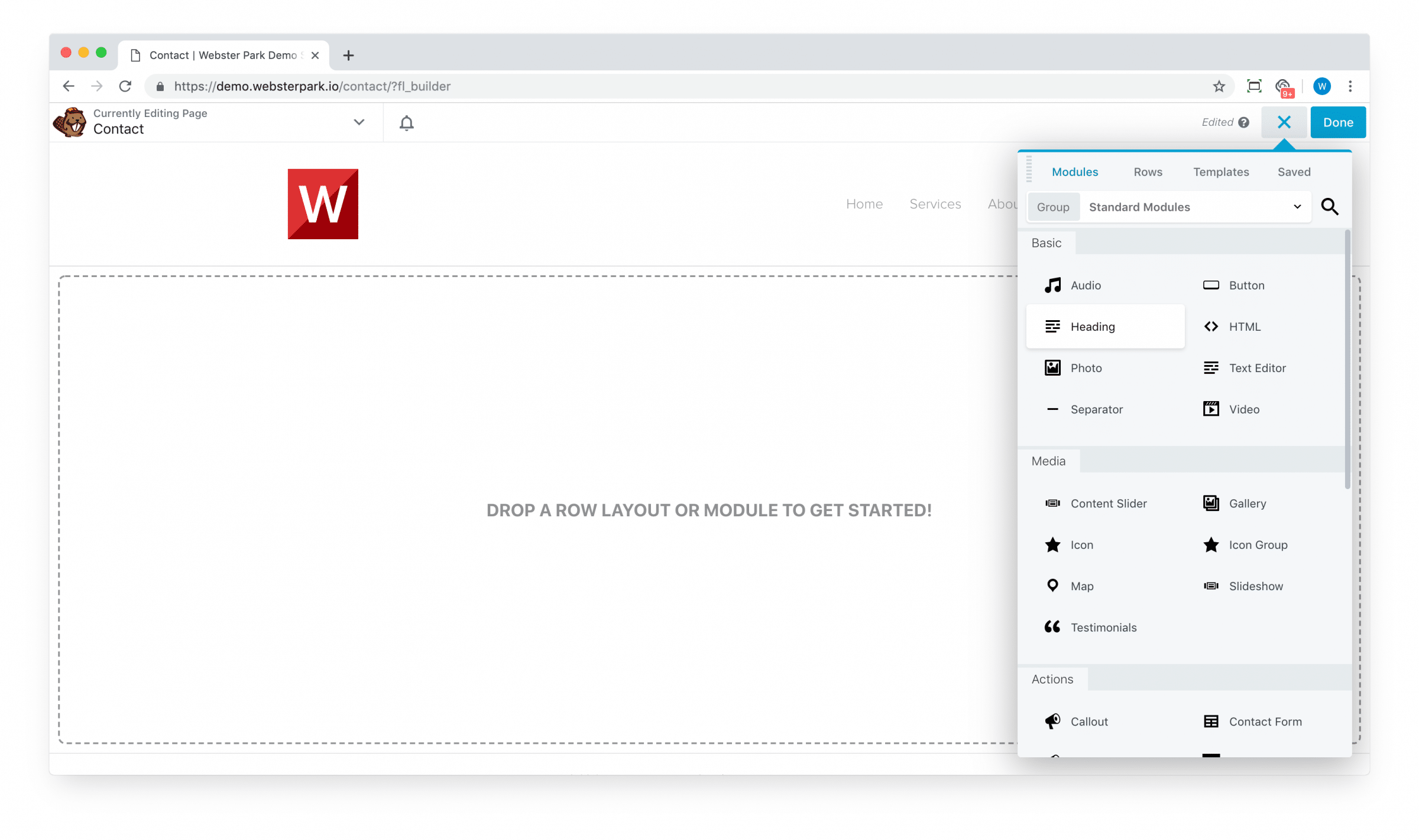
Or go ahead and drag a Module (the containing Row and Column will be created automatically):
Module basics
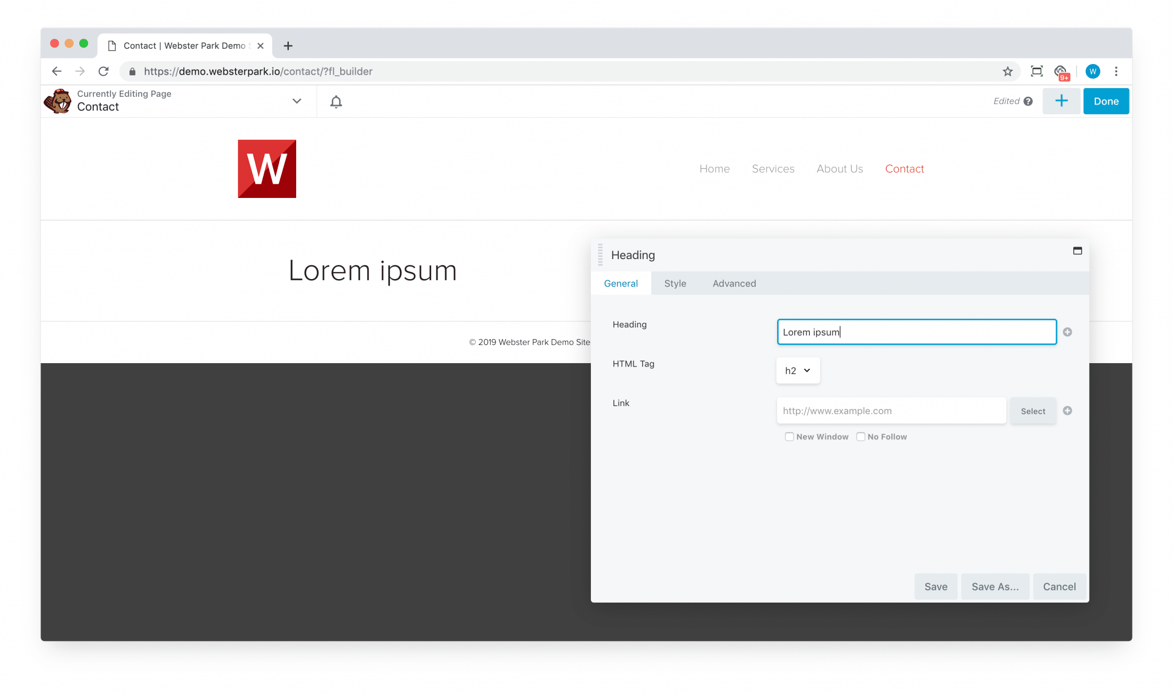
Virtually all modules have a General tab which contains the basic content:
… A Style tab which is responsible for various styling options:
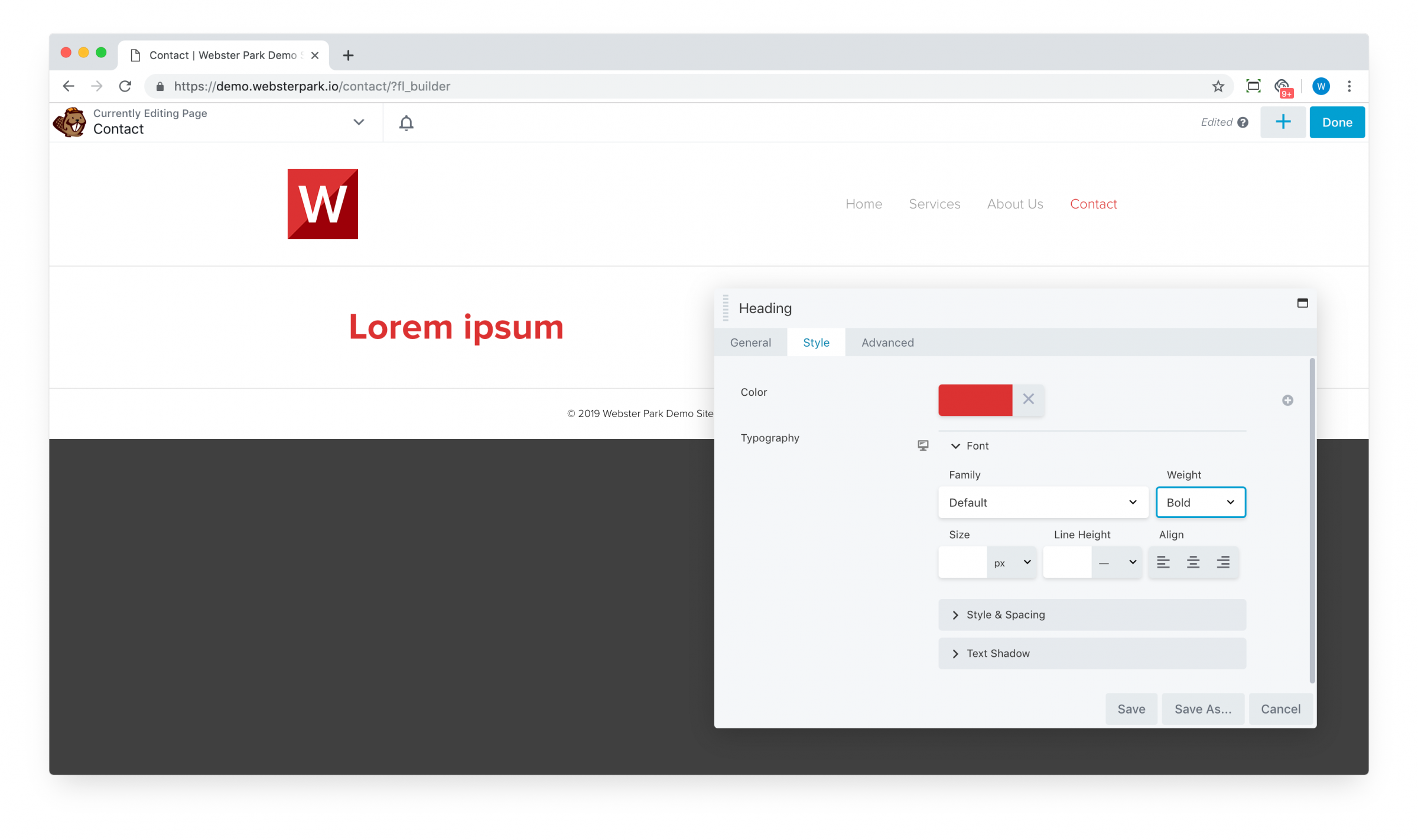
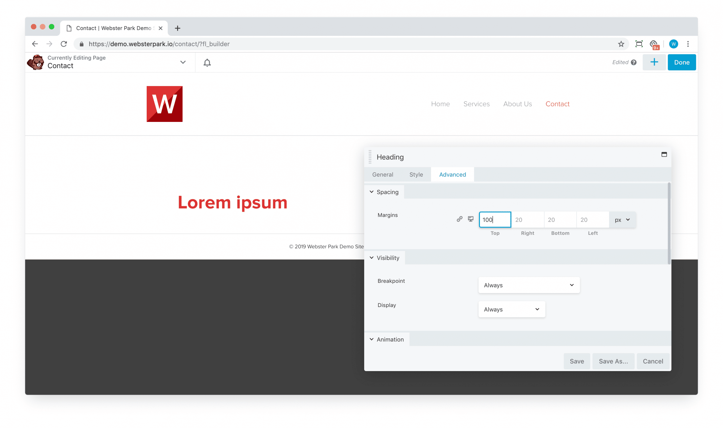
… And an Advanced tab, which offers capability to manipulate positioning (margin, padding), toggling responsive display, animation and more. (Details below.)
As you type, select an image or perform other actions, the builder will update in real-time (usually) to reflect your changes.
Manipulating modules
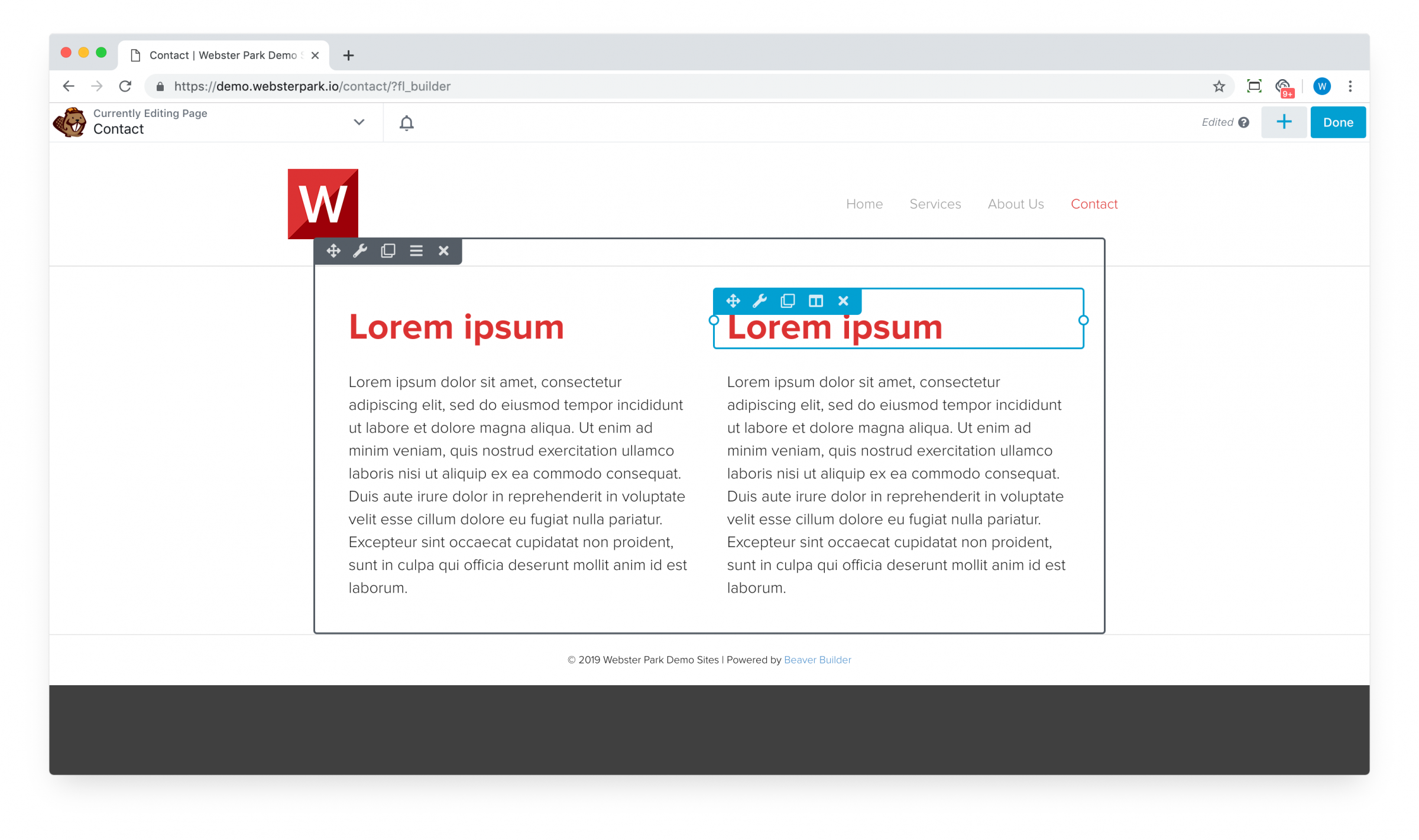
You can move (reposition), edit, duplicate or delete a module by hovering your mouse over it to pull up its menu:
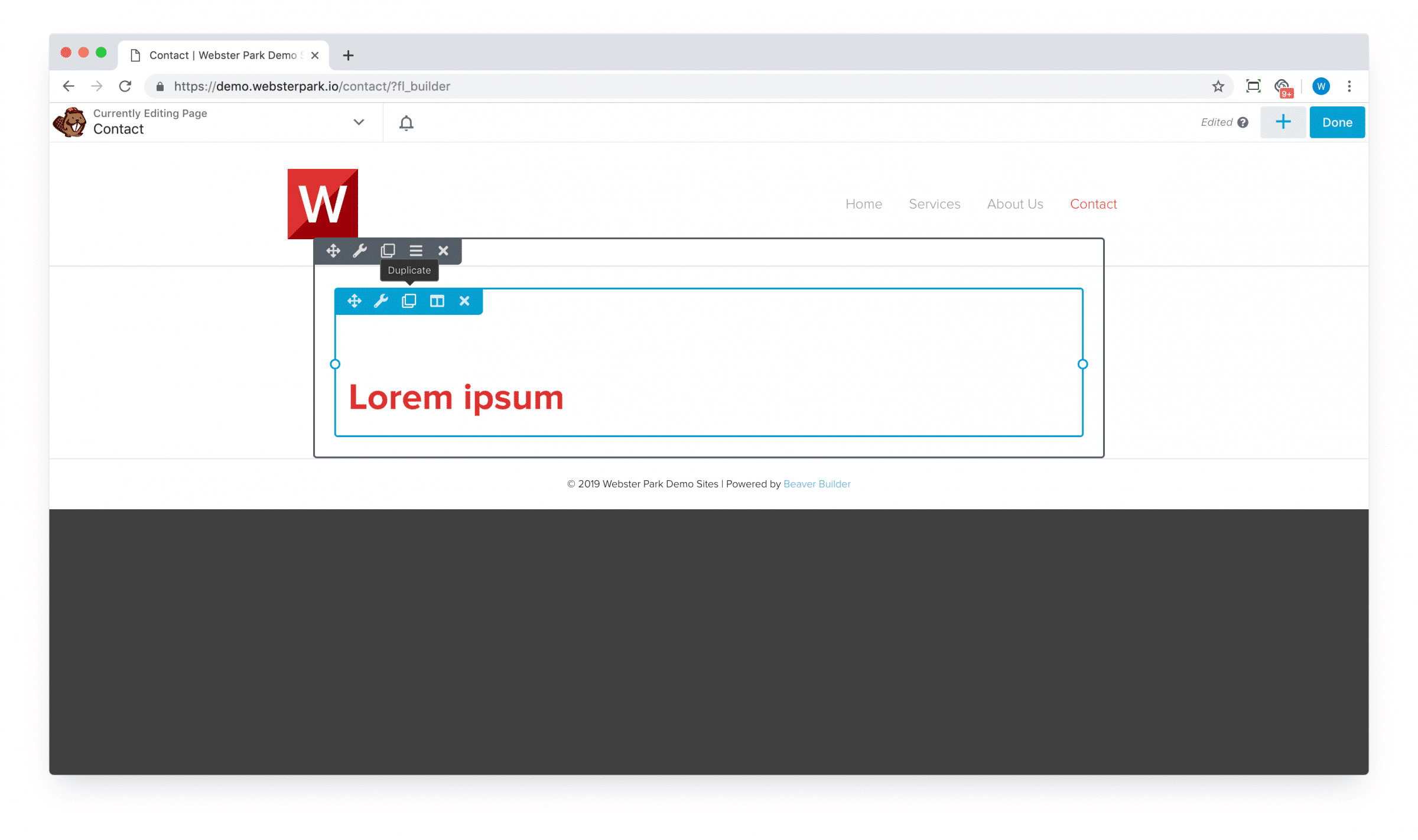
In the above screenshot, the blue border is the module itself; the gray represents the surrounding row.
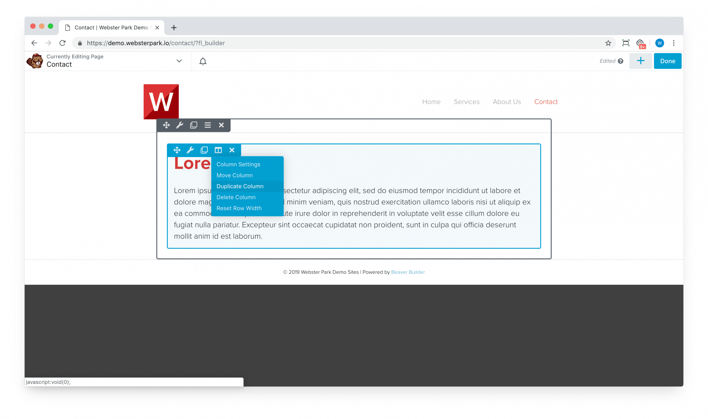
Managing columns
In Beaver Builder, modules are positioned next to one another with columns:

You can click on the column icon (folded into the Module properties selector) to edit Column properties.
Three quick tips for use of columns
1. Duplicating columns
In some cases, columns will contain similar content and it’s faster to duplicate a column than to recreate it:
Easy!
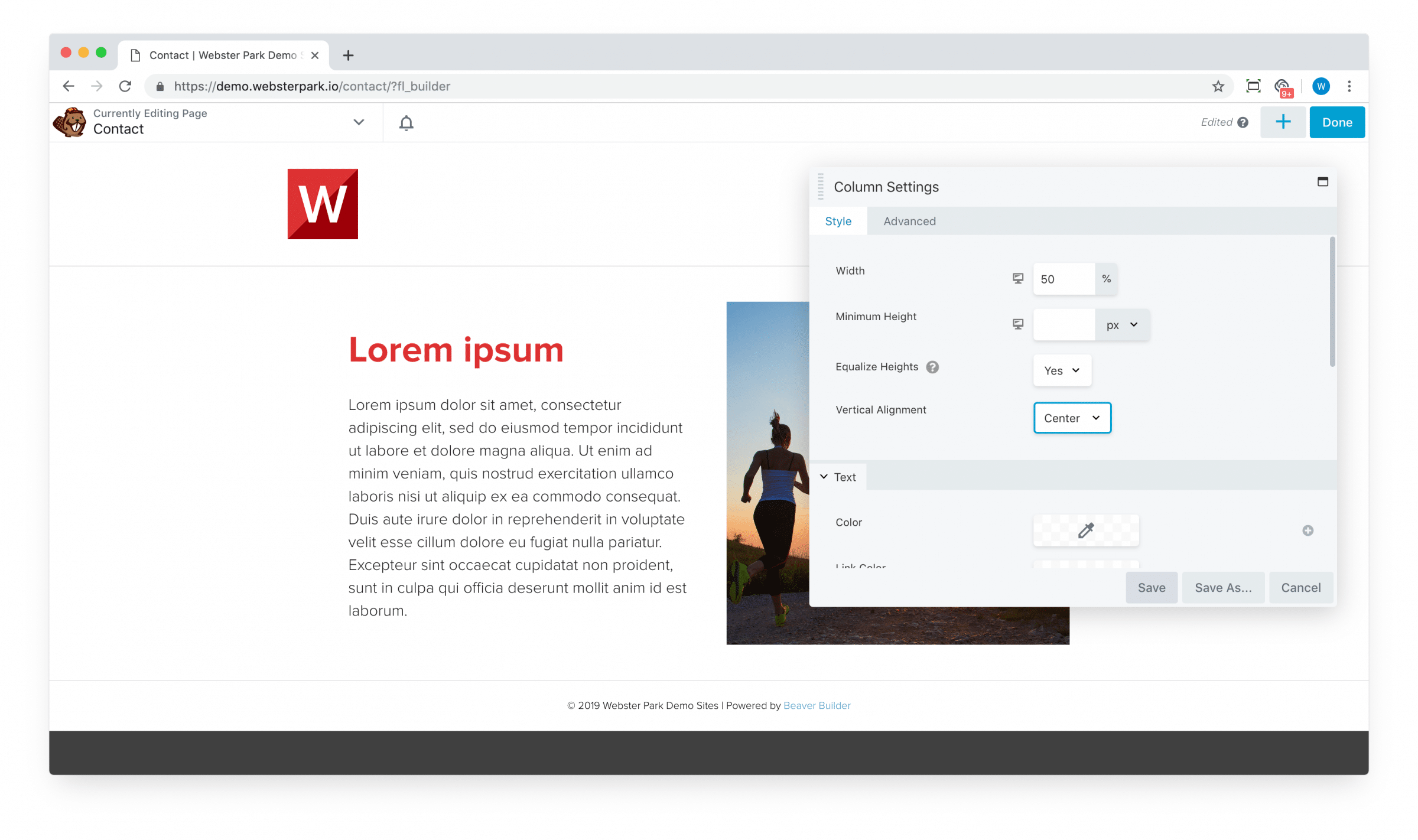
2. Vertical alignment
Often, we want the columns to be of equal height and for the content to align in the middle:
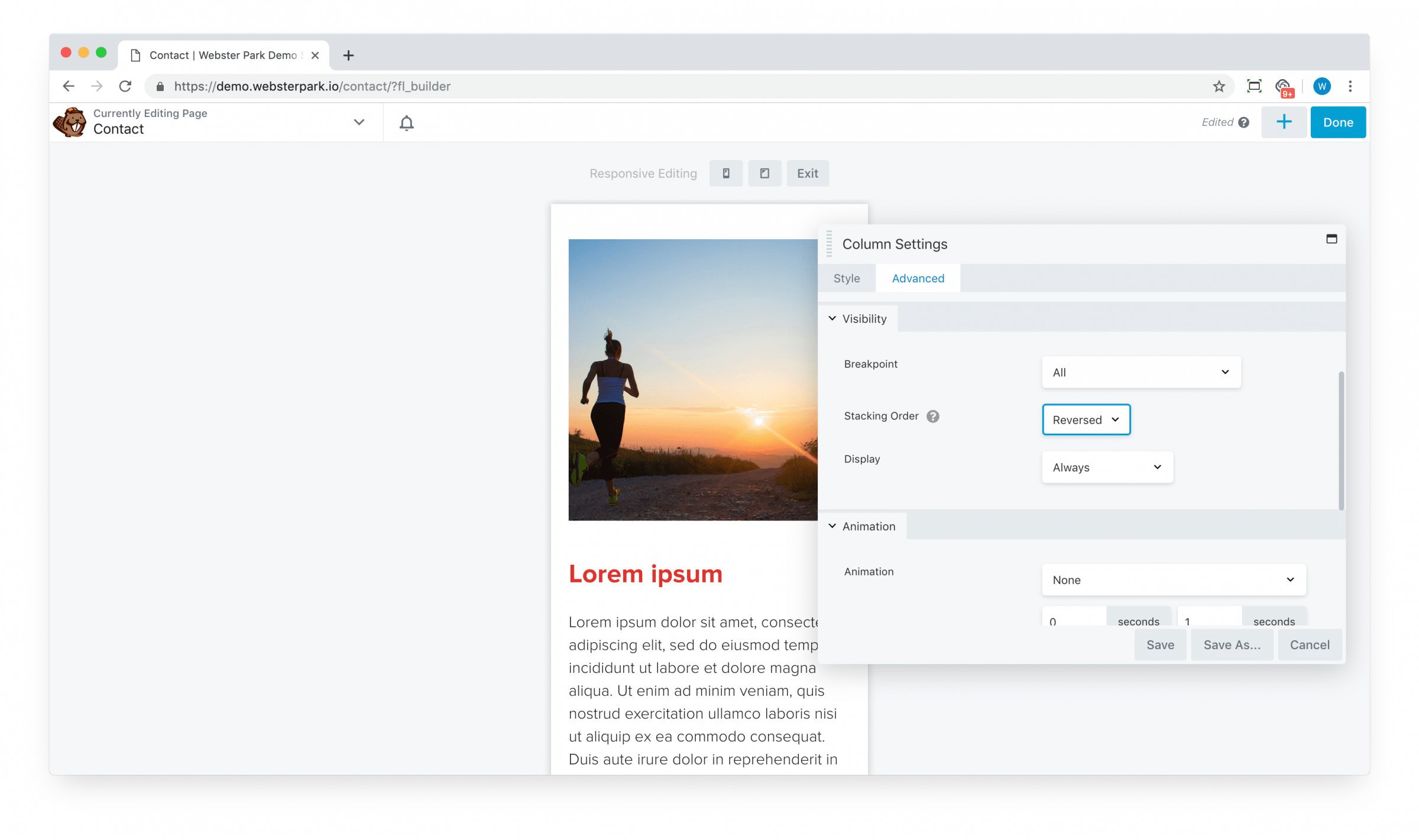
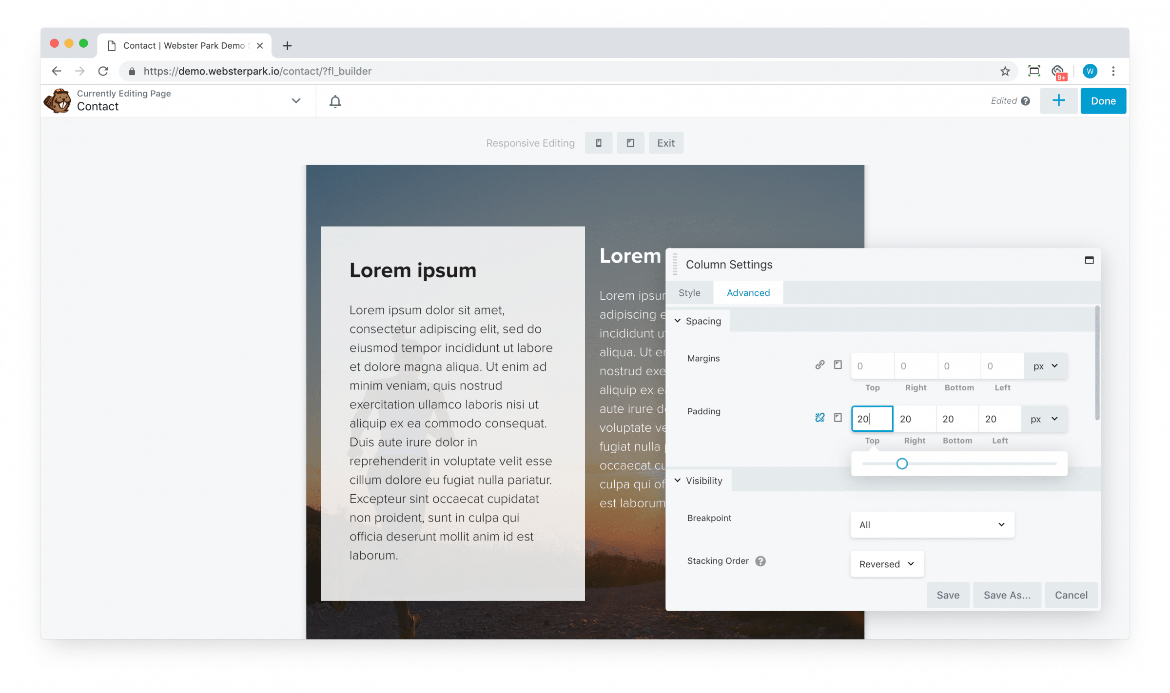
3. Stacking order
Beaver Builder is mobile responsive and by default, will “stack” columns on a mobile view, from left to right.
Often, this is exactly what we want it to do; in some cases, however, we’d prefer their stacking order to be reversed.
We can easily accomplish that in the Advanced tab, with the Stacking Order:
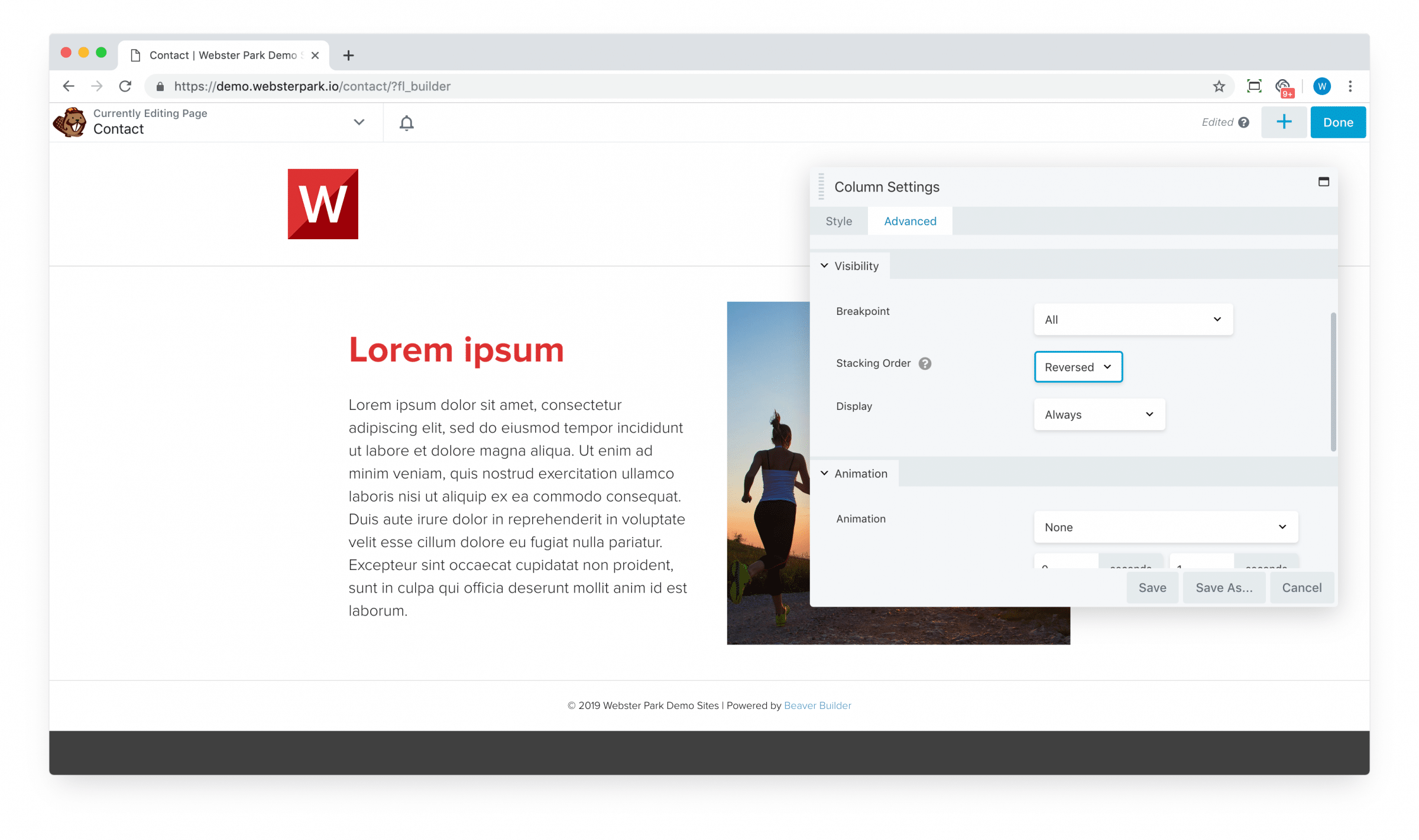
Which yields this:
Inheritance and cascading effects
Suppose you have a row with a background image, which contains two columns, each with a heading and a text module:
Not very legible, right?
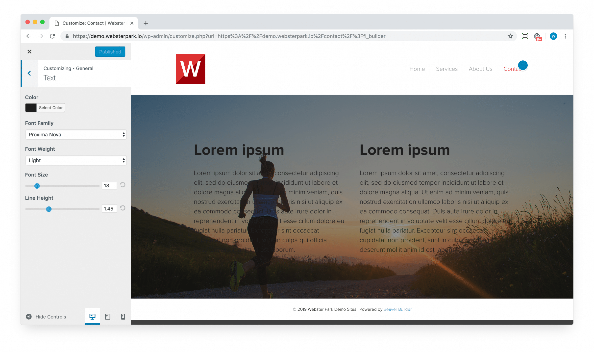
By default, the builder will [correctly] apply your theme’s global (sitewide) settings. If you’re using the Beaver Builder child theme, those live in Appearance > Customizer:
So how can we make this text white?
Of course, by now, you’re familiar with the Style tab on your modules; your first instinct might be to open them up and update the color, module by module. I.e.:
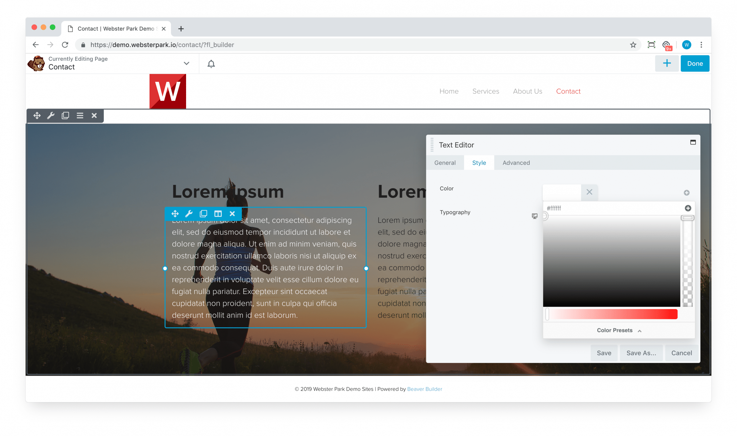
While this approach certainly works, Beaver Builder actually provides a much faster way.
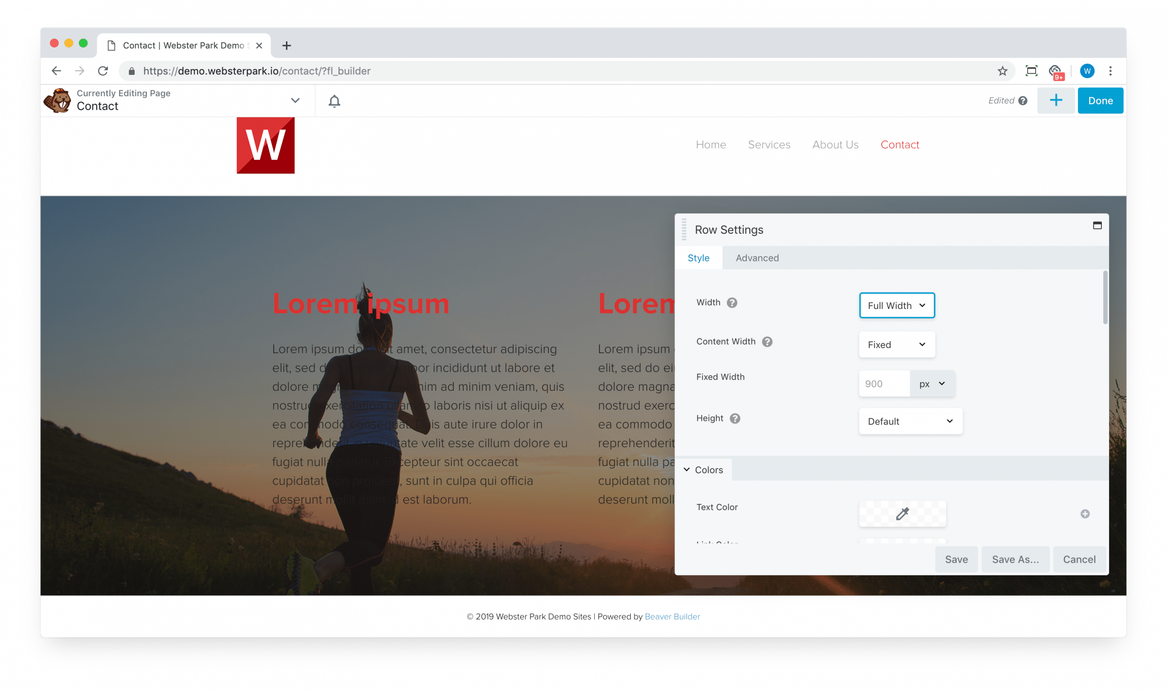
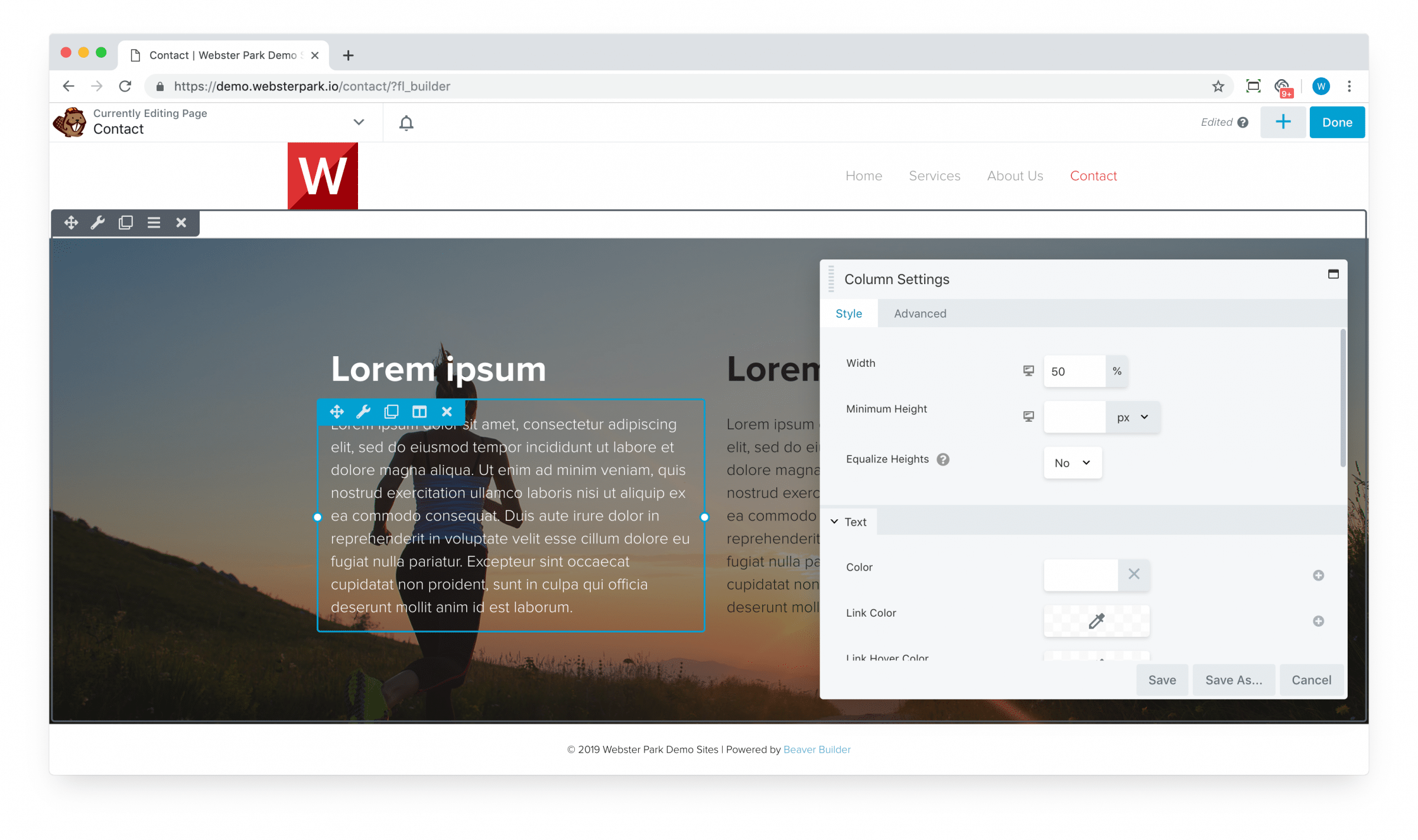
You can also update styling at the containing column level:
Or at the containing row level:
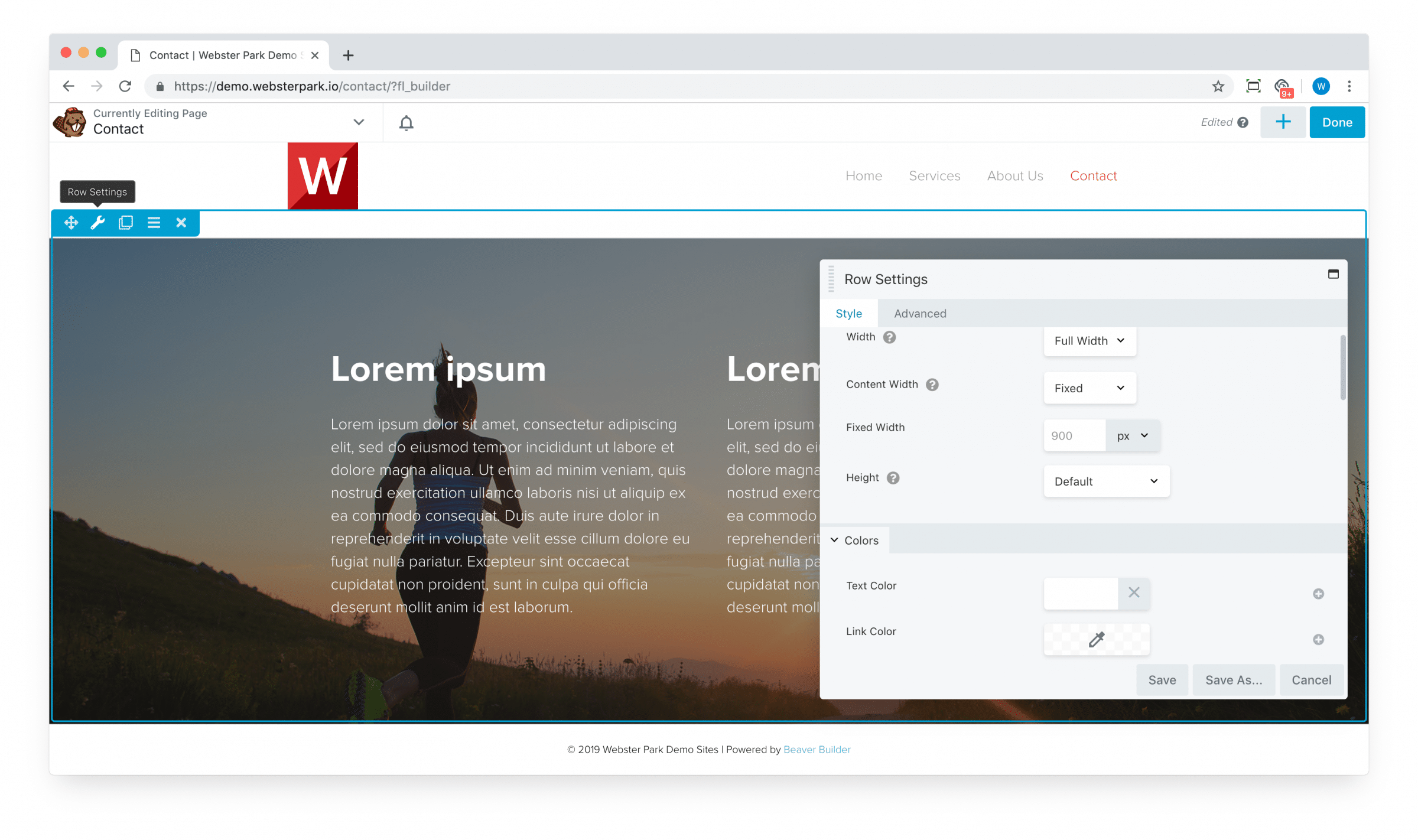
The bottom line? If you know you want all of your text within a row to be of uniform color, then make that change once at the row level, rather than N times for N modules. (Similarly for column-specific styles.)
Finally, note that if a row specifies one color, an interior column a second color, and the interior module yet a third color, then generally speaking, the most specific or innermost setting will always be the winner.
The Advanced tab
All rows, columns and modules contain an Advanced tab which feature a handful of useful settings. We’ll review them briefly below.
Margin
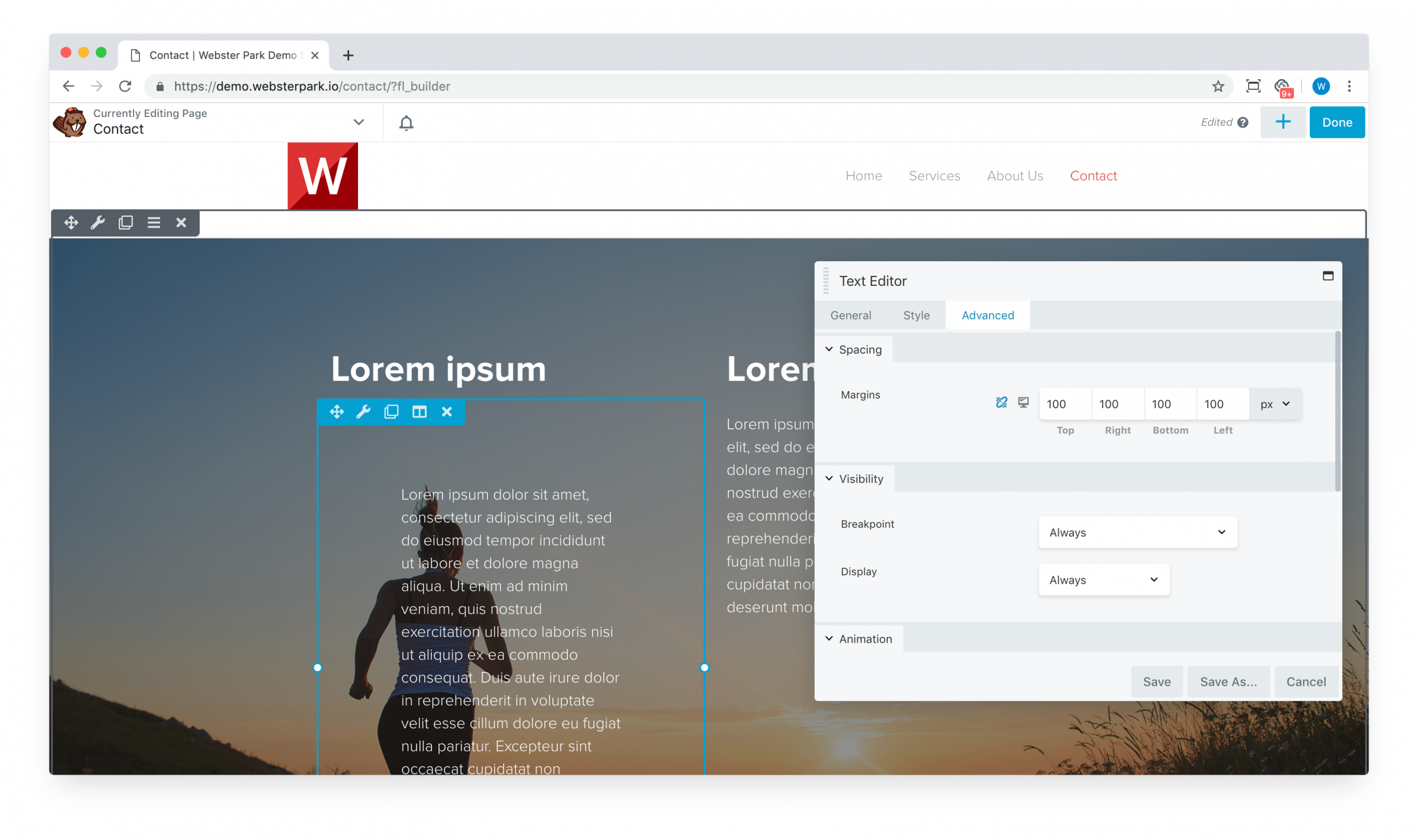
Typically, for a module, we leave this at the default 20px. If there is need to create additional spacing between adjacent elements, then we typically use row or column padding instead.
(This certainly isn’t a “rule” or even a best practice; it’s just our habit and something we generally try to stick to for consistency.)
Responsive display
Occasionally, we want to adjust the display of a module, column or row on certain devices (e.g. a smartphone or a desktop). The Responsive Layout option allows you to do just that:
Publishing your work
When you’re finished (or ready to take a break), click Done to the top-right.
Ready to go live? Hit Publish.
You can also Discard any changes made since you last Published, or even Save Draft if you don’t want to lose your work but aren’t ready to publish it just yet.